Two points in the check look inconspicuous: "Mobile viewport, passed" and "HTML language, passed, en." Both often pass without anyone ever thinking about them, because a good theme sets them automatically. That is exactly why they are worth a look, because if they are missing or wrong, you do not notice for a long time, and the damage is real anyway. The viewport tag decides whether your page is usable on a smartphone. The lang attribute decides whether Google, screen readers, and browser translators know your page's language. Two single lines of code, both with an impact far beyond their size.
The viewport meta tag, one line with big impact
The viewport tag is a single line in the <head> of the page. It looks like this:
<meta name="viewport" content="width=device-width, initial-scale=1" />
What it does is best understood through the problem it solves. Without this tag, a smartphone browser assumes it has to display a wide desktop page and squeezes the entire layout onto the small screen width. The result: the page appears tiny, the text is unreadably small, and the user has to pinch-zoom and scroll sideways to make out anything at all.
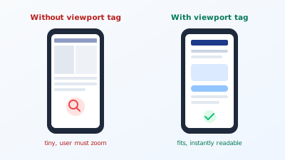
The tag tells the browser: "Take the actual device width as the width and set the zoom to normal." Only then can a responsive design take effect and adapt cleanly to each display. The page then shows a phone-friendly view on a phone, a wider one on a tablet, the full one on desktop. The tag itself does not make the page responsive, that is the job of the CSS, but without the tag even the best responsive design stays ineffective on a phone.
Why mobile comes first today
The importance of the viewport tag can only be understood by knowing how Google works today. Google has indexed websites on a mobile-first basis for years. That means: not the desktop version of your page is the basis for the assessment, but the mobile one. What works badly on a phone hurts the ranking even when the desktop version is perfect. Google describes this approach in detail in its own documentation on mobile-first indexing.
Behind this is a simple reality: on most websites today, more than half the traffic comes from smartphones, in many industries considerably more. A page that is unusable on a phone therefore loses not a fringe group but the majority of its visitors. Forget the viewport tag and you essentially build a page that is broken for the most important device class.
The effect connects directly to load time. A page set up poorly for mobile is usually also a slow page, because it loads oversized desktop resources onto the phone. How strongly speed influences rankings is explored in the post on load time and Core Web Vitals. Mobile readiness and speed belong together, and both are often decided at this one tag.
A real example shows how consequential a missing tag can be. A trades business had a website from 2013 that was never reworked. On desktop it looked fine, but on a smartphone the whole page appeared as a tiny, unreadable thumbnail, because the viewport tag was missing. The owners wondered why hardly any enquiries came through the site, even though it ranked decently for its service. The reason: three quarters of visitors came from a phone, saw the unusable thumbnail, and bounced immediately. Retrofitting the viewport tag and a lean responsive layout doubled time on site and enquiries within a few weeks. A single missing line had turned away the majority of visitors.
What else makes a page mobile-friendly
The viewport tag is the entry ticket, but on its own it does not make a page pleasant to use. Three more things decide whether the mobile view really works.
Tap targets large enough. On a phone you operate with a finger, not a precise mouse pointer. Buttons and links that are too small or too close together lead to mis-taps and frustration. A minimum size of around 48 pixels and enough space between elements makes the difference between smooth operation and annoyance.
Readable font size. What still works on desktop is often too small on the little screen. A base font size you can read without zooming is mandatory. Force the user to enlarge, and you have half lost already.
No horizontal scrolling. If the user has to swipe right on a phone because an element is wider than the screen, something is wrong. Common causes are fixed pixel widths, over-wide tables, or large images without a limit. A mobile-friendly page fits within the screen width, always.
These three points are what Google sums up as mobile-friendliness. The viewport tag opens the door, but the design has to walk through it.
The lang attribute that declares the language
The second tag sits right at the top of the HTML, on the opening <html> element:
<html lang="en">
This small attribute declares the page's main language. It sounds like a formality but has three concrete effects that all come to nothing without it.
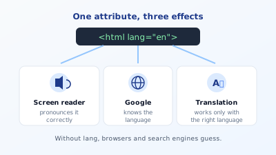
First, pronunciation by screen readers. A reading program for blind users has to know which language to read a text in, otherwise it pronounces words with the wrong sound rules, which sounds incomprehensible. The lang attribute gives the screen reader exactly that information.
Second, understanding by Google. The language declaration helps the search engine confirm which language your page is written in and serve it to the right users. On multilingual sites it is the foundation on which the language links via hreflang can work cleanly in the first place.
Third, browser translation. The automatic translation feature of modern browsers only triggers reliably when the source language is correctly declared. If the wrong language is stated, the browser may suggest a translation where none is needed, or omit it where it would be wanted.
Try it yourself: The free SEO check at yourseo.app/analyse checks whether your page has a viewport tag and a valid language declaration, alongside ten other on-page fields. In under 30 seconds you see whether both foundations are in place.
Setting both tags correctly
For both there is a small number of rules that cover almost everything.
Take the viewport tag exactly as is. The standard line width=device-width, initial-scale=1 fits nearly every page. Stay away from settings that forbid zooming, such as maximum-scale=1 or user-scalable=no. It may look tidy, but it takes away visually impaired users' ability to enlarge the page and is an accessibility violation. Allowing zoom is mandatory, not optional.
Declare the language by standard. The lang attribute uses the language codes of the BCP 47 standard. For plain English, en suffices, for a regional variant there is en-US, en-GB, or en-AU. For most pages the simple en is entirely enough. The W3C explains in its guide to language declarations when a regional code makes sense and when it becomes superfluous.
Language and content must match. The attribute has to name the actual language of the page. An English page with lang="de" is worse than no declaration at all, because it actively misleads screen readers and search engines. On multilingual websites, each language version carries its own correct declaration.
Mark up individual foreign-language passages. If an English page contains a German quote, that passage can get its own lang="de" on the enclosing element. Then the screen reader reads exactly that part with German pronunciation and the rest in English. This is fine-tuning, but on pages with many quotes a noticeable gain in clarity.
Common mistakes with viewport and language
Four patterns show up especially often.
The first is the completely missing viewport tag on older sites. Websites built before the smartphone era and never reworked simply do not have it. They appear tiny on a phone, and in the age of mobile-first indexing that is a serious ranking problem, not a cosmetic one.
The second is the zoom ban. Out of a desire for a flawless layout, some developers block zooming with user-scalable=no. This excludes visually impaired users and is flagged by audit tools as an accessibility shortcoming. A clean responsive design never needs this ban.
The third is the wrong or missing language declaration. Sometimes the lang attribute is missing entirely, sometimes a theme template leaves lang="en" on a German page because the default template was English and nobody adjusted it. Both confuse screen readers and search engines.
The fourth is the inconsistency on multilingual sites. The German and English versions both carry the same language declaration because they come from the same template. This undermines the whole language separation. How closely accessibility and clean markup are linked also shows in heading structure, which works on the same principle: correct markup helps human and machine alike. Before publishing, it is worth looking at the whole picture through a full on-page check, which assesses viewport and language alongside the other technical fields.
How to test viewport and language
Both tags can be checked in minutes, without any special tool. For the mobile view, open your page on desktop and drag the browser window very narrow. If the layout snaps cleanly into a phone-friendly view, the viewport sits right. If a tiny desktop page remains or a horizontal scrollbar appears, the tag or the responsive design is missing. More precisely, use the device view in the developer tools, which you open with F12: there you can simulate various phone sizes and see at once where it pinches.
You check the language declaration via the page source. Right-click the page, choose "View page source," and look at the top to see what is in the <html> element. The language stated there should be the one actually spoken on the page. On multilingual sites, do this test for each language version separately, because this is exactly where template mistakes creep in, with all versions carrying the same declaration.
This short routine after every relaunch or theme change prevents one of the two foundations from quietly getting lost. Especially when switching themes, such head tags are often overwritten without it being noticed in everyday use.
Quick FAQ
Does the viewport tag automatically make my page mobile-friendly? No. The tag is the prerequisite, but the actual adaptation is done by the responsive CSS. Without the tag the best responsive design has no effect, with the tag but without responsive design the page stays unusable anyway.
Is lang="en" enough or do I need en-US?
For most pages en is enough. A regional code like en-GB only makes sense if you deliberately reflect regional differences in language or content, such as British spelling or prices.
Does a wrong lang attribute really cause harm?
Yes, more than a missing one. An English page with lang="de" makes screen readers pronounce the text incorrectly and can mislead Google in classifying the language. Better no declaration than a wrong one.
How do I tell whether my theme sets the tags?
Via the page source in the browser. Search the head area for name="viewport" and at the very top for <html lang=. Both should be present and correct.
Is mobile readiness really as important as desktop? It is more important. Google primarily assesses the mobile version, and on most pages the majority of visitors come from a smartphone. To neglect a page on mobile is to neglect the main channel.
Do I need the lang attribute even if my site has only one language? Yes. Even a single-language page benefits: screen readers read correctly, and Google gets the language unambiguously confirmed. The attribute is not a pure multilingual tool but belongs on every page, regardless of how many languages there are.
At a glance
Two small tags, two big levers. The viewport tag clears the way for a mobile-friendly layout and, in the age of mobile-first indexing, is not a detail but a foundation. The lang attribute declares the language and ensures screen readers read correctly, Google knows the language, and browser translations trigger. Each costs one line of code, and both, when wrong or missing, do considerably more harm than their size suggests. Take the standard viewport tag, allow zooming, and declare the language correctly by BCP 47, and you have laid two often-overlooked foundations cleanly. Both feed directly into your visibility on Google.