"2 H1 headings found, there should be exactly one to make the main topic clear." This finding looks like a technical nitpick, but it points to something fundamental: your page does not clearly say what it is about. The H1 is a page's main heading, the answer to the question "what is the topic here?" If there are two of them, there are two answers, and both Google and a person using a screen reader have to guess which is right. Headings are not decoration. They are the scaffold that lets readers and search engines work their way through your content.
What the H1 is and why there should be exactly one
Headings in HTML are numbered, from H1 to H6. The number is not a styling instruction but a ranking of importance. H1 is the top level, the main heading of the whole page. H2s are the large sections below it, H3s the sub-points within a section, and so on. This numbering describes the logical structure of the content, regardless of how big or bold the text ends up looking.
The H1 has a special role: it names the one topic of the page. Just as a book has one title and not two, a web page has one main heading. Several H1s are like two different book titles on the same cover. The reader is confused, and Google has to interpret what is actually meant.
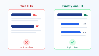
Technically, today's HTML standard does allow several H1s within different regions of a page. In practice, though, and especially from an SEO point of view, exactly one H1 per page is the clear recommendation. It makes the main topic unmistakable, and it forces you, while writing, to commit to one topic instead of squeezing two into one page. A page with two equally weighted main topics is usually a page that would be better as two.
The H1 is not the same as the title tag
This is where the most common confusion arises. Title tag and H1 sound similar but are two different things in two different places.
The title tag sits in the <head> of the page, visible in the browser tab and above all in the search results. It is what the user clicks in the Google list. The H1, by contrast, sits in the visible content of the page, right at the top, and is the first thing the visitor reads after clicking. How to optimise the title tag for the snippet is covered in the dedicated post on title and meta description.
The two may resemble each other but need not be identical. On the contrary, it is often smarter when they differ. The title tag is optimised for clicks from the search result and may be punchy and keyword-heavy. The H1 speaks to the visitor who is already on the page and may be more detailed or inviting. A page about tax classes might carry the title "Change tax class: guide, deadlines, forms" and the H1 "How to change your tax class in three steps." Same topic, different tone, each text for its purpose.
Why two or zero H1s causes harm
The problem with several H1s is rarely a direct penalty. Google copes and picks one if it has to. The damage is more subtle and works on three levels.
First, topical clarity. Google uses the headings to understand what the page is about and which queries it is relevant for. Two competing H1s dilute that signal. Instead of a clear "this page is about X," Google gets a fuzzy "this page is about X and Y," which weakens relevance for both topics.
Second, accessibility. People using a screen reader often jump from heading to heading to get an overview. A clean hierarchy is their table of contents for the page. Two H1s or skipped levels break that navigation. This is not just an SEO question but one of accessibility, and the two are more closely linked than many think. The W3C describes in its guide to heading structures why a logical order is crucial for usability.
Third, the opposite case: no H1 at all. Some pages, often homepages with a purely image-based design, have no real heading at all, only a logo and slogans as graphics. Then Google lacks the most important text anchor to grasp the topic. No H1 is just as much a problem as two.
A real example shows how inconspicuously the problem starts. A cleaning company had a landing page meant to rank for "office cleaning Munich." The visible heading read exactly that, everything seemed right. In the source code, though, that heading was an H2, while the theme output the company name at the top as the H1. So for Google, the page's main topic was the company name, not the service. After the rebuild, company name out of the H1, service in, the page climbed from position 11 to position 6 within six weeks, without a word of body text changing. The heading had been there all along, just on the wrong level.
Try it yourself: The free SEO check at yourseo.app/analyse counts the H1s on your page and checks whether the heading hierarchy is cleanly nested. In under 30 seconds you see whether your topic is set unambiguously.
The hierarchy: nesting H2 and H3 cleanly
The H1 alone is not enough. Below it the outline opens up, and that too follows a simple rule: never skip a level.
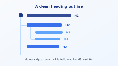
After the H1 come H2s for the large sections. Within an H2 section come H3s for the sub-points. Only within an H3 would an H4 follow. What should not happen: jumping straight from the H1 to an H3 because the H3 looked better visually. That tears a hole in the logical structure, as if a book had Chapter 1, then sub-section 1.1.1, without 1.1 ever existing.
A good test is to imagine an automatic table of contents. Read only your headings, top to bottom, and ask whether they form a sensible outline of the page. If so, the hierarchy is clean. If the headings read on their own make no coherent thread, the structure is off, no matter how nice the individual page looks.
You can check this directly in the browser, without a tool. Right-click your heading and choose "Inspect." In the code panel that opens, you see whether it says <h1>, <h2>, or something else entirely. Many discover this way for the first time that their supposed main heading is technically just a bold-formatted paragraph, not a heading at all, but a <div> or <span> with large text. In that case Google is missing the heading completely, even though visually everything looks right. That is exactly why separating structure from styling is more than a formality: what looks like a heading must also be one.
What matters is keeping structure and styling apart. Headings are not tools to make text bigger or bold. Choosing an H2 only because the font is then larger abuses the structure for design. Size and style belong in CSS, the heading level describes importance of content. Keeping this separation clean is half the battle.
Writing the H1 correctly
Once it is clear there is exactly one H1, the question remains what goes in it. Four points make the difference.
The main keyword belongs in it. The H1 should contain the page's central search term, ideally near the front. This helps Google confirm the topic and the reader see at once they are in the right place.
It should match the search intent. The H1 has to deliver the promise the user read in the search result. Someone who clicked "change tax class" wants to see a heading at the top that is exactly about that, not a creative slogan that talks around the topic.
Not too long. An H1 is a heading, not a paragraph. A short, clear line is stronger than a nested sentence. If you want to say more, say it in the first paragraph below.
Different on every page. Just like the title tag, the H1 should be unique per page. If thirty pages carry the same H1 because the template hard-sets it, the same problem arises as with duplicate titles. How much original content a page needs to genuinely differ is covered in the post on how many words a page needs.
Common mistakes with headings
Four patterns show up especially often, and all arise from confusing structure with design.
The first is the logo as H1. On many themes, the site logo at the top left is technically marked up as an H1. Then every single page on the domain carries the same H1, namely the company name, and the actual page heading slips to H2. This is the most common reason for "logo name as H1 on every page" in audits.
The second is the duplicate H1 from theme and editor. The theme automatically sets an H1 from the page title, and the editor writes a second one in the content, not knowing one already sits at the top. Suddenly the page has two, exactly the finding from the check.
The third is the heading for styling. A word should look bigger, so it gets wrapped in an H2 even though it is not a section in terms of content. Such pseudo-headings fray the outline and confuse automatic parsing.
The fourth is the skipped level. After the H1 comes an H4 directly, because its font size happened to fit. To Google and screen readers, that is a break in logic. The fix is never to switch the level, but to adjust the CSS so the right level also fits visually. Before publishing, it is worth looking at the whole picture through a full on-page check, which assesses the headings alongside the other fields.
Quick FAQ
Are several H1s a direct ranking disadvantage? Rarely as a hard penalty. Google processes several H1s too. The disadvantage is the diluted topical clarity and broken accessibility, which feeds through to rankings indirectly.
Does the H1 have to be identical to the title tag? No. They may resemble each other, but it is often better when they differ. The title is optimised for clicks in the search result, the H1 speaks to the visitor who is already there.
How many H2s may a page have? As many as there are genuine sections. There is no upper limit. What matters is that each H2 introduces a standalone section and does not just visually divide text.
My theme sets the logo as the H1. What do I do? In the theme or via a tweak, switch the logo from H1 to a neutral element and make sure the actual page heading carries the H1. Many themes have a setting for this, otherwise a small template change helps.
Can the H1 be an image or logo? If at all, then only with a meaningful alt text that contains the heading text. Better is real text as the H1 and the logo as a separate, linked image beside it. Plain image text without alt text is invisible to Google.
At a glance
The H1 names the one topic of the page, which is why there should be exactly one, not two and not none. It is not the title tag but the visible main heading in the content, and it may deliberately differ from the title. Below it, H2s and H3s nest into a logical outline, without skipping levels and without abusing headings for design. Treat headings as structure rather than a styling tool, and you make the topic clear at a glance for Google and for every reader. It is one of the few SEO fixes done in minutes that still pays off on every single page. Clear headings are a small but steady contribution to your visibility on Google.